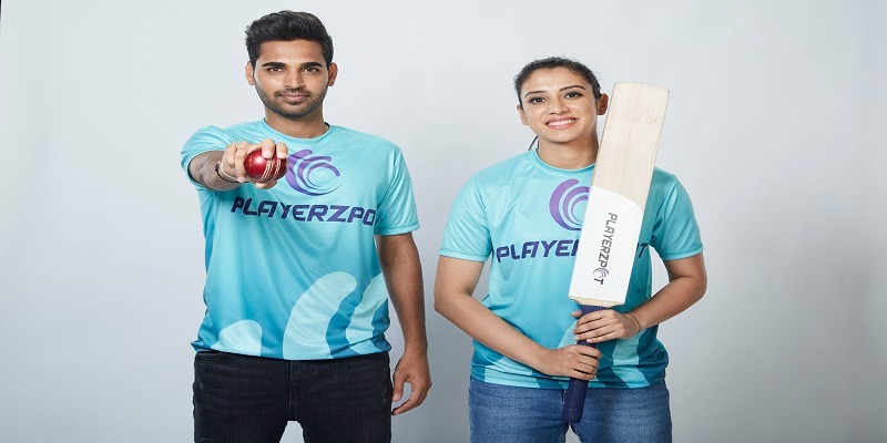
PlayerzPot, has unveiled its extensive rebranding just in time for the 2021 IPL. The platform’s rebranding is an effort to accelerate the company’s growth and renew its corporate vision. The exhaustive efforts include the company’s corporate logo, tagline, and consumer promotions – all aligned to its intended TG’s hopes and dreams.
The new avatar is very slick, youthful, and vibrant. It mirrors the brand’s purpose of building a delightful level-playing field for aspiring and skilled gamers across the country. Its unveiling during the IPL season is sure to amplify the already high-octane enthusiasm of avid cricket fans and fantasy gamers alike.
The new positioning presents the platform as an exciting new playing field for all kinds of casual gamers and fantasy sports fans. The new tagline also underlines the platform’s commitment to constantly innovate with new features across fantasy games, casual games and quizzes to become India’s ultimate gaming destination. The breakout campaign for this fresh new approach comes in the form of a bassline-thumping rap song performed by one of India’s most popular rappers – KaamBhaari, in a vibrant digital commercial featuring brand ambassadors Bhuvneshwar Kumar and Smriti Mandhana.
The new campaign asks one question to its viewers in the form of an earworm-in-the-making – PlayerzPot Pe Khela Kya? The commercial will be rolled out across Disney+ Hotstar and on all of PlayerzPot’s digital platforms. The entire rebranding exercise, including a new tagline, a fresh visual identity, and a catchy new rap anthem that has been conceptualized by Interactive Avenues – A Reprise Network Company, and created by Prime Focus Technologies.
The new logo inspiration came from the unpredictable spin of a cricket ball that only skilled players can overcome. This ‘spin’ motif illustrates the importance of skill and insight needed to win the game. The new neon colour palette brings a new youthful and fresh feel to the brand. And the electrifying energy from the new rap makes it the perfect contender to be the sports anthem for the ongoing IPL season. The theme of the anthem and video depict the joy and enthusiasm experienced by the common man when they play on the app. Candid, optimistic, and approachable – these are the new buzzword’s in PlayerzPot’s brand personality.
Talking about the rebranding initiative, co-founder and director Mitesh Gangar says, “It’s a major milestone for the company as the fantasy sports gaming market is accelerating and there is a unique opportunity for the PlayerzPot brand to become synonymous with the excitement around IPL 2021. The platform has blossomed into a fresh, peppy, young brand while retaining all the factors that made us a trustworthy and much-loved app in the first place. The future seems even more exciting to us now, something which is echoed in our new brand colors, tagline and theme song.”
CEO Sunil Yadav,, says, “Our business has grown and evolved colossally in a short span of time, and we feel it’s time to make an impactful impression on our target audience. We have revisited our logo, tagline, and other important elements for these to reflect who we are today and to symbolize our future. We always strive to deliver the best experience possible and ensure that new games, features, and offers are constantly being added to appeal to a larger audience and have something for everyone.”
Interactive Avenues creative director Eshwari Pandit, says, “We knew we needed to create that unique differentiator from the spurt of fantasy gaming platforms. We realized very quickly on that it was PlayerzPot’s multi-game and fantasy sports offerings. With a game for absolutely every kind of player – it is an app clearly poised to be India’s new playground. The tagline and rap paints a vibrant, inviting world that is sure to excite every kind of gamer.”
Interactive Avenues creative director Suraj Talaulikar, says, “The idea of the logo came from the common unpredictable spin action found in every game, whether ball or dice. And the fact that it takes skill to play that spin and come out on top. The new visual identity is cool, young, and exciting – something that definitely stands out and puts the platform at an edge above the rest while appealing to our target audience.”
