The success of the gaming industry depends on various factors. While gameplay elements like strategy and theme are important in attracting an audience, aesthetically pleasing features also help keep people engaged. Similarly, game designers want to show their audience, not tell, and colours give the audience clues about the setting and the characters and what they need to do. It also sets the tone of the game.
The crucial yet continuously changing role colour plays in how we perceive the world is why we have studies like colour psychology. However, you would be surprised how many game studios miss out on this opportunity to use colour to subvert a player’s biases in exciting ways. With that said, there are a few games that have done just that.
A Brief Overview Of Colour Psychology
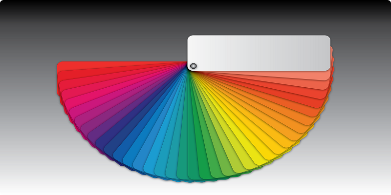
In the 1660s, Sir Isaac Newton discovered how the colour spectrum is composed, but the study of colours and how they affect people’s moods have origins dating back to the Ancient Egyptians. Typically, you can divide a colour scheme into warm tones (red, yellow, orange) or cool tones (blue, purple). However, the setting in which these colours are used can create different feelings.
Warm Tones
Colours like red evoke emotions like anger and aggression, but red can also be viewed as warm and loving, depending on how you use it. A great contrasting example is the mystery video game Firewatch and the multiplayer first-person shooter game, Team Fortress 2. The vibrant world of red and orange in Firewatch gives off a feeling of comfort and safety, and the palette is reflective of the colours you think of when you imagine a sunset. However, in Team Fortress 2, the use of red indicates danger and that it’s time to go to war.
Cool Tones
Cool colours like blue can also have different meanings. Blue can be both inviting and cold, and we often see cool colour palettes in science fiction games to illustrate a futuristic environment. One example of a blue colour scheme used to represent a futuristic setting is Electronic Art’s action-adventure video game series Mirror’s Edge. The beautifully cinematic video game franchise is a fan favourite, but unfortunately, according to Gamebyte, there won’t be a third instalment coming out soon despite recent speculation.
Meanwhile, purple is often associated with royal nobility and luxury. That could explain why NetEnt’s online video slot game Starburst has purple jewels for reel symbols. Starburst is one of the most popular games, and it has been, according to the review site Casino Smash, since it launched almost ten years ago. This long-standing popularity could be for a few reasons. First, it’s because the game offers quality casino bonuses like free spins. It could also be because the game’s aesthetic is effective in attracting and maintaining players. It perfectly blends cool colours like purple with warm colours like red.
Game designers use other colour schemes outside of cool and warm tones. For instance, Western-themed video games like Red Dead Redemption often use muted colours like brown and grey. The colour palette that gets selected is up to the developers, but they have to ensure they know why they’ve chosen it and they understand how it fits into creating the tone and ambience of the world they’ve built.


